
The visual memory of humans is much stronger than our other memories and color is one of the indispensable visual aspects where you can effectively engage with human subconsciousness and influence the decision-making process. However, poor color choice for your brand can negatively impact your message or your product. Get it wrong, and your great brand can easily be overlooked.
Big brands stay ahead of this game because they keep minor details in mind and work upon them from their initial stages. With some basic exposure to color psychology and thoughtful planning, smaller brands could reap the same benefits as those enjoyed by the bigger ones.
There are a few generalizations about how people respond to color and how colors are perceived, and that’s what we’re going to look at.
The Color Red

Red is a very powerful, compelling color that reflects our physical needs whether to show intimacy and love, or to portray danger, and courage. It is an intense color that is packed with emotion.
If you’re looking to have a really powerful presence or get someone’s attention fast, red is your go-to color. Just remember to use it sparingly to avoid the repugnant feelings it can easily awaken when used in excess.
The Color Orange

Orange is known to be a color of chirpiness, motivation, a positive attitude, and enthusiasm for life. While made up of red and yellow, it carries less aggression and fierceness than the color red due to its combination with the calming color yellow.
Studies show that the orange color can create physical effects such as a heightened sense of activity, increased socialization, boost in aspiration, stimulated mental activity, increased contentment, and assurance. If you are looking to incorporate such feelings into your brand – go with orange.
The Color Yellow

Yellow often has conflicting associations. On one hand, it stands for freshness, happiness, energy, enlightenment, joy, which explains why most of the kid toys and emoticons are yellow but on the other, it may be associated with caution and distress.
Yellow is the most visible color of the spectrum. The human eye processes yellow first. Yellow is often used in advertising and marketing to capture one’s attention instantly. However, too much yellow can motivate people to become overly critical and judgmental. Use yellow as your major brand color only if you have any underlying relevancy or need.
The Color Green

Green is such a happy color. It’s the color of life, renewal, freshness, nature, and energy. It is also a sign of growth, whether that’s in a physical object like plants or our income and wealth. This is why we often find green being associated with brands in the finances, banking, food, agriculture, and energy sector.
Green is also understood to be the most restful and relaxing color for the human eye to view. So, if you’re looking to express growth, comfort, and eco-friendliness, green is your color.
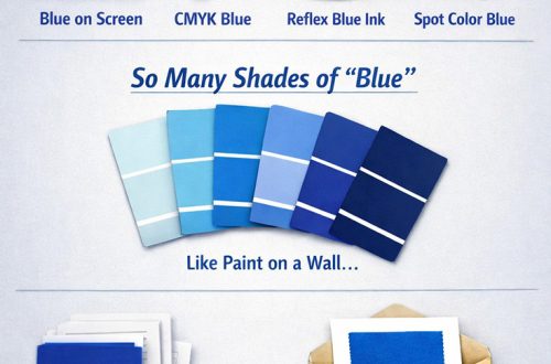
The Color Blue

Blue is the most universally favored color of all and therefore the safest to use. It relates to trust, honesty, and dependability, therefore helping to build customer loyalty.
Blue works well for the corporate world and is often used for more conventional businesses such as accountants, insurance companies, banks and other financial companies where trust and reliability are important. It is also known that light blue variants help to slow human metabolism and create a calm and soothing feeling. But remember that too much blue can promote boredom or manipulation, as there are already too many blue brands out there.
The Color Purple

Different shades, tints, and hues of purple have different meanings. Light purple hues represent gentle energy, wisdom, dignity and delicacy, as well as romantic and nostalgic feelings. Dark purple hues evoke feelings of gloominess and mystery. Bright purple hues suggest riches, royalty and magic.
Too much purple is known to cause introspection or distraction. Use it wisely.
The Color Pink

Pink is feminine, romantic, affectionate, intimate and caring. Light pink represents the unselfishness and innocence and is often associated with things like flowers, babies, little girls, cotton candy, and sweetness.
This color is usually seen in cosmetics, fashion, beauty, and romance.
The Color Brown

The color brown is an earnest, down-to-earth color signifying stability, structure, and support. The downfall to brown is that it’s the safest color and can seem reserved and boring.
Commonly, brown is only seen in brands where it has relevance to its products as in coffee shops, home furnishings and decors.
The Color Gold

Across the world gold consistently represents some variation of prosperity, luxury, and treasure. It also has an element of charm and confidence. Gold has long been associated with royalty throughout the world.
If you are looking for a color that represents a perfect blend of luxury, glitz, and glamour – Gold should be the one.
The Color White

The psychological meaning of white is purity, humility, sincerity, and wholeness. White is a great color for simplicity and cleanliness.
It offers a sense of peace and calm, comfort and hope. However, too much white can cause isolation, loneliness, and emptiness. On the other hand, its metallic derivative – shades of silver – is often associated with being industrial, sleek, high-tech, modern, elegant and graceful.
The Color Black

In businesses and brands, black represents sophistication, boldness, and independence.
Black tends to make a product appear more expensive, and is often paired with gold and silver in luxury products and accessories.
In recent times there are several major brand redesigns (like Uber, Burberry, The Guardian) that made use of black & white combination to appear more authentic, minimal and bold.
—
The messages the color sends to your customer base can have a major impact on your business success.