Print Graphic Design Is Different From Web Design. Here’s Why
So I was talking to one of our in-house designers today about the differences between print and graphic design. The conversation was so informative that I felt that it was worth making a note of and sharing the highlights. I hope this helps you to understand why a good graphic designer always asks whether a design is meant for web viewing or printing.
The Question of Resolution & Filetype
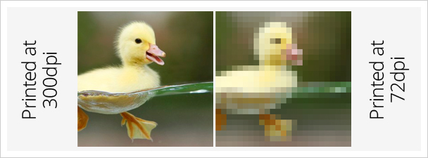
Images designed for the web usually are created with a resolution of 72 dpi (dots per inch) while those created for print need to have a much higher resolution of 300 dpi. Making sure that the draft design is created at this resolution will ensure that your brochures or business cards are sharp and clear.
The standard print only filetype used in printing is TIFF, though printers also use JPG, PDF, EPS and PNG in various situations.
And that’s why DPI matters
Bleed Area Matters
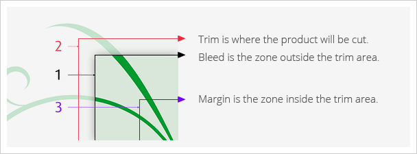
Trim, Margin and Bleed
Please, please let your designer know that your design is meant to be printed. If you don’t she’s unlikely to provide bleed space in the design. Bleed is a printing term that refers to the area to be trimmed off. The bleed gives the printer a small amount of space to account for movement of the paper, and design inconsistencies. Artwork and background colors can extend into the bleed area. After trimming, the bleed ensures that no unprinted edges occur in the final trimmed document. Bleeds in the US generally are 1/8 of an inch from where the cut is to be made. Trust us, your printer will thank you for including bleed area.
Go over Final Drafts with a Microscope
We’re all so used to creating content on a computer that we know can be modified to suit our needs. It’s easy to forget that a printed design is final and fixed. The proof of the final copy becomes very important in this case because once you print, you may have to pay for it even if there’s an error you didn’t notice beforehand. Listen to your designer when she asks you to sign off on the final design. Understand that the final design is really final and won’t be altered.
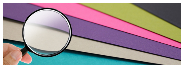
Disclaimer: Using a Magnifying glass may or may not improve proof reading abilities
Color Selection
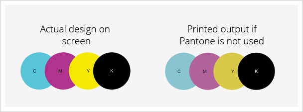
You have to be careful when choosing your colors in your design program. To be safe, you want to use a Pantone Color Picker. Pantone (or PMS) colors are single colors and use the RGB model for Red Green and Blue. This will ensure that the colors printed match the colors you see on your screen.
For full color designs, professional print machines use CMYK system to run print jobs. What is CMYK? It stands for the four ink colors used by all printers: cyan, magenta, yellow, and black. Designers identify individual colors they want to use for a printed project with codes that give the percentage of each type of ink required to form a certain color. For instance, if you wanted to use the same shade of blue that Twitter uses for its logo, the company’s style guide tells us that the CMYK color code for “Twitter Blue” is 70/10/0/0 — that’s 70% cyan ink, 10% magenta ink, and no yellow or black ink. You could then input that code into your design software and use the same exact shade of blue that Twitter does.