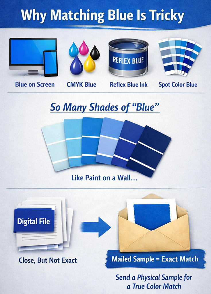
Blue seems simple, until you try to match it.
If you’ve ever approved a blue logo or design on a screen and then been surprised by how different it looked when printed, you’re not alone. The truth is that “blue” isn’t one color. In printing, there are many different ways blue is created, and each method can produce a noticeably different result.
Blue on a Screen vs. Blue on Paper
When you view blue on a computer, tablet, or phone, you’re seeing light, not ink. Screens use RGB (red, green, blue) light to create color. That means:
- Screens can show very bright, vivid blues
- Most screens are not color calibrated
- Two people viewing the same file on different screens may see different blues
What looks perfect on your monitor is only a representation, not a guarantee.
CMYK Blues: Built from Four Inks
Full color printing uses CMYK (cyan, magenta, yellow, and black). CMYK blues are created by mixing percentages of these inks together.
Because CMYK relies on ink absorption instead of light:
- Blues can appear more muted than on screen
- Small changes in ink percentages can shift the color noticeably
- Paper type affects how the blue looks (coated vs. uncoated paper)
A CMYK blue is always an interpretation, not an exact match to what you see digitally.
Reflex Blue: A Standard, But Still a Choice
Reflex Blue is a pre-mixed spot ink, commonly used in commercial printing. It’s more vibrant and consistent than most CMYK blues, which is why many brands use it.
However:
- Reflex Blue is one specific formula
- It may not match an existing printed blue exactly
- On different papers, it can still look slightly different
Reflex Blue is consistent, but it’s not universal.
Spot Color Blues: Pre-Mixed, Not Unlimited
Spot color blues (such as Pantone® colors) are mixed using specific ink formulas rather than CMYK builds. They provide better consistency across print runs.
But even spot colors:
- Look different on coated vs. uncoated paper
- Can vary slightly between printers
- Are still limited to predefined formulas
A spot color is closer, but not always identical to a previously printed piece.
The Paint-on-the-Wall Analogy
Think of blue like paint on a wall.
You can walk into a paint store and ask for “blue,” but you’ll be shown hundreds of blues:
- Light blue
- Navy blue
- Royal blue
- Cool blue
- Warm blue
Even if you bring a photo of a blue wall, the paint store can’t guarantee a perfect match. The only way to match it is to bring in a physical paint chip.
Printing works the same way.
Why a Mailed Sample Is the Only True Match
If you’re trying to match an existing printed color, there is only one reliable method:
Send a physical sample through the mail.
A printed sample allows the printer to:
- See the actual ink on actual paper
- Account for finish, coating, and ink density
- Compare under proper lighting conditions
Screens, PDFs, and color names can guide the process, but they cannot replace a physical reference.
The Key Takeaway
- Screen blues, CMYK blues, Reflex Blue, and spot color blues are all different
- There are virtually unlimited shades of blue
- Digital previews are approximations, not guarantees
- A mailed sample is the only way to achieve an exact match
When color matters (especially to match your existing brand colors), always start with a physical reference. It’s the printing equivalent of bringing the paint chip to the store.